backdrop-filter - The CSS Property You Should Know About

The Backdrop Filter Property
What is it?
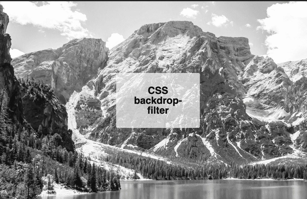
backdrop-filter is a CSS property that applies filter functionality to everything behind the element it is set on. Important! — This effect is applied behind the element, so you will need to set the background of the element to be partially transparent. Example Background Transparency: background-color: rgba(255, 255, 255, 0.3); this is a great way to do so by adjusting the a (alpha) - the parameter to be between transparent (0) and opaque (1).
Example Backdrop Filter Use
.element-to-effect-behind {
  // Insert filter function of choice below
  backdrop-filter: blur(10px);
  // Apply transparency
  background-color: rgba(255, 255, 255, 0.4);
}
Available Filter Functions
- blur()
- brightness()
- contrast()
- drop-shadow()
- grayscale()
- sepia()
- invert()
- hue-rotate()
- saturate()
Backdrop Filter vs Filter
The two are similar properties and have access to the same filtering functions. However, backdrop-filter can be used to avoid an unnecessary container element, common with filter property usage.
Learn more about filter (until I write a blog post about it) - CSS Filter
Extras / Things to Note
- This property is intended for container elements
- It does not apply to graphics elements or
defselement background-filter: none;= No filter applied- Stack filters in a single line
backdrop-filter: sepia(80%) drop-shadow(2px 2px 14px red) saturate(100%); - Approved for all browsers except IE and Firefox for Android, with an 88.27% global rating on Can I Use
Useful Implementation Ideas
- Selections of text that you’d like to stand out to be more readable on top of images
- Modals
- Great for elements you’d like to make pop or stand out in front of another element in general
- Stylized images and content without a photo editor
- Simple overlays
Conclusion
In conclusion, backdrop-filter is a nifty property to have in your arsenal. It helps to create PhotoShop-esque effects with a friendly CSS one-liner and it can simplify your UI. Spark up those creative juices and try it out!
Play Around with Backdrop Filter on CodePen